Perpetua (typeface)
 | |
| Category | Serif |
|---|---|
| Designer(s) | Eric Gill |
| Foundry | Monotype Corporation |
| Date released | 1929 |
| Variations | Perpetua Titling |
Perpetua is a typeface that was designed by English sculptor and typeface designer Eric Gill (1882–1940) for Monotype. It is classified as a transitional serif font, designed in the style of fonts such as Baskerville from the late 18th and early 19th century with high stroke contrast, a vertical stress and bracketed serifs. Along with these characteristics, Perpetua bears the distinct personality of Eric Gill's letterforms, for example the lack of serif on the top left of the 'a', the extended leg of the 'R' and the calligraphy-influenced italic 'g'.[1] Perpetua was designed as a font for books and body text, with a matching Titling style for headings. It was also released in Greek.
Development

Gill began work on Perpetua in 1925 at the request of Stanley Morison, typographical advisor to Monotype.[2][3] Morison sought Gill's talent to design a new typeface for the foundry. By 1929, Perpetua Roman was issued as Monotype Series 239.[4]

Perpetua was set in a limited edition of a new translation by Walter H. Shewring of The Passion of Perpetua and Felicity, giving birth to the name of the typeface and its original companion italic. The book was printed in 1929. The same type and illustrations (also done by Gill) for that book subsequently appeared in the Fleuron (number 7) which was edited by Stanley Morison and printed in 1930. Also set in Perpetua and published in 1929 was Gill's Art Nonsense and Other Essays.
The process of Perpetua's development was somewhat convoluted.[5] Gill designed two companion italic faces for Perpetua. The first, a typeface called Felicity, was a sloped roman, in which the regular style is slanted without the different letterforms of italic type. This unusual design decision was primarily due to Morison's opinion that a sloped roman form was preferable to that of cursive italics for use in book text. However, Felicity met with great criticism from Monotype management, who went so far as to declare it "worthless."[6] Perpetua's release was thus halted until Gill designed a second italic, called Perpetua Italic, which Monotype subsequently released alongside Perpetua Roman.[4] Telltale distinctions of the unused Felicity include the absence of a serif at the baseline of the lowercase d and a straight tail on the lowercase y.[4] Overall, Felicity is less sloped than Perpetua Italic.

Morison appears to have had some tension with the Monotype production team on the project, one of the British Monotype branch's first truly original designs, going so far as to commission French punchcutter Charles Malin to cut a version as an experiment without the involvement of Monotype's regular machining team at Salfords.[7][2] Mosley suggests that a rubbing of a 1655 engraving at Rye may have been an influence on the design. A slightly condensed italic alphabet Gill had drawn for Everard Meynell of the Westminster Press was considered as a basis for its italic also at one point.
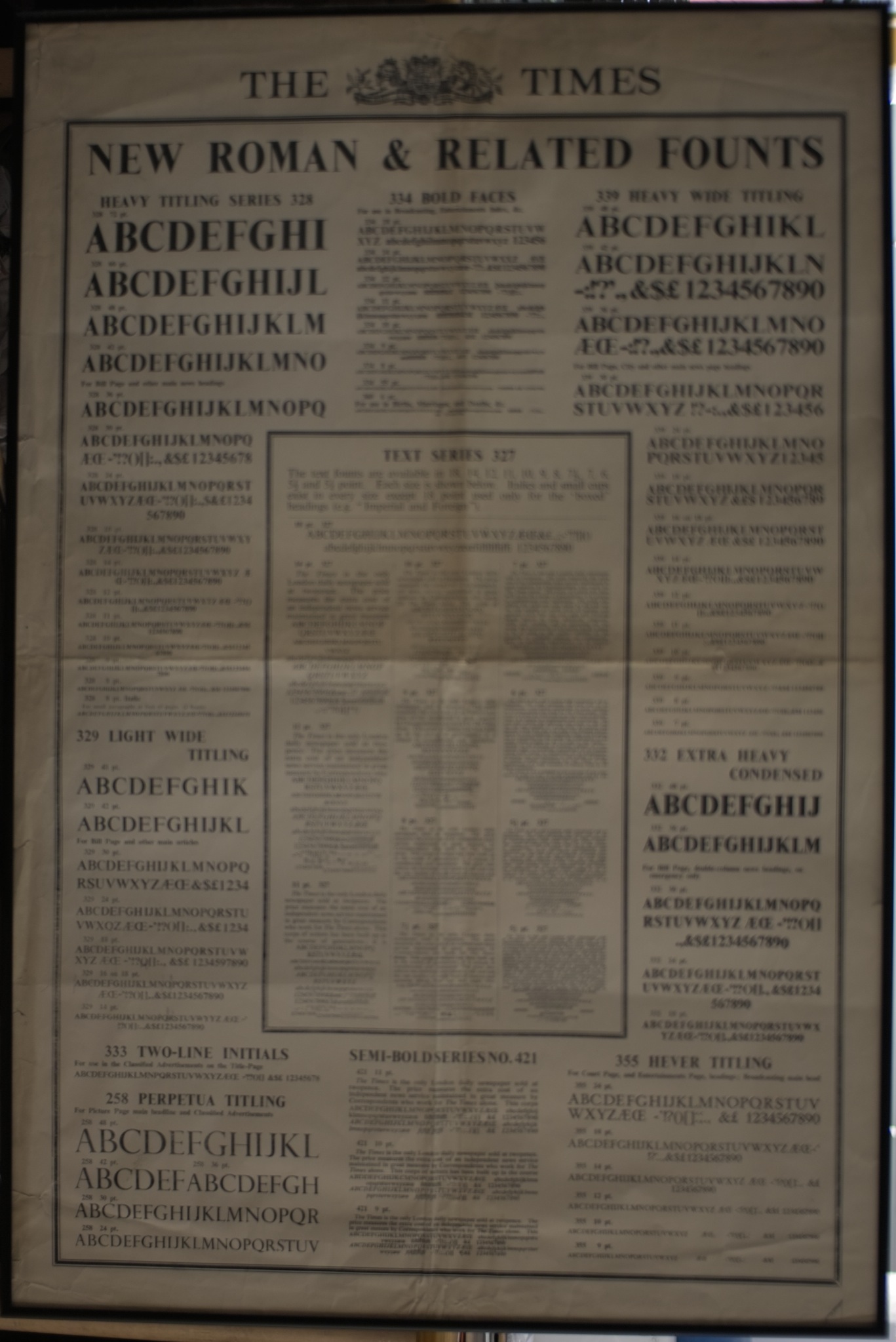
While working on the project Morison engaged Gill also to begin work on a sans-serif design, which became Gill Sans.[8][9] Morison also suggested that the Times switch to a modified version of Perpetua when asked for ideas for its redesign.[10] In the end Monotype created a new font, Times New Roman, for that project instead, but the Times did use Perpetua Titling for some sections in the metal type period.[11] Robin Kinross has noted that Perpetua's basic design is "hardly robust enough for newspaper printing."[10]
Users
- Continental Airlines[12]
- University of Edinburgh[13]
- University of Pennsylvania[14]
- Colby College[15]
- Routledge Critical Thinkers book series[16]
- The 1987 film The Untouchables: poster and wordmark.[17]
References
- ↑ Mosley, James. "Eric Gill’s R: the Italian connection". Type Foundry. Retrieved 11 November 2015.
- 1 2 Wardle, Tiffany (2000). The story of Perpetua (PDF). University of Reading. p. 5. Retrieved 2009-03-26.
- ↑ Harling, Robert (1978). The Letter Forms and Type Designs of Eric Gill (2nd ed.). D. R. Godine (The Typophiles). p. 36. ISBN 0-87923-200-5.
- 1 2 3 Harling, Robert (1978). The Letter Forms and Type Designs of Eric Gill (2nd ed.). D. R. Godine (The Typophiles). pp. 36, 48–51. ISBN 0-87923-200-5.
- ↑ Haley, Allan (1992). Typographic milestones ([Nachdr.]. ed.). Hoboken, NJ: John Wiley & Sons. pp. 91–98. ISBN 9780471288947.
- ↑ http://www.fonts.com/FindFonts/HiddenGems/Perpetua.htm Monotype Imaging: Perpetua
- ↑ Mosley, James (November 10, 2015). Lecture on Gill's work (Speech). 'Me & Mr Gill' talk. Old Truman Brewery, London.
- ↑ MacCarthy, Fiona. Eric Gill. p. 300. ISBN 9780571265824.
- ↑ Loxley, Simon. Type. p. 163. ISBN 9780857730176.
- 1 2 Kinross, Robin (2004). Modern Typography: an essay in critical history (PDF) (2nd ed.). London: Hyphen. pp. 76–79. ISBN 978-0-907259-18-3. Retrieved 19 December 2015.
- ↑ http://www.identityworks.com/forum/identity-strategy/the-united-airlines-rebranding-strategy/#more-329 Identity Works
- ↑ "EASE" (PDF).
- ↑ http://www.upenn.edu/webguide/style_guide/typography.html Penn: Web Style Guide: Typography. Referenced 1/14/2011.
- ↑ http://www.colby.edu/communications/identity/manuals/downloads/ColbyIdentityStnds.pdf
- ↑ "Routledge Critical Thinkers".
- ↑ Coles, Stephen. "The Untouchables (1987) Movie Poster". Fonts In Use. Retrieved 1 January 2016.
External links
- History of Perpetua Greek
- Perpetua MT (professional release including small caps and text figures)
- English Serif (alternative release from Fontsite; also includes small caps)
| ||||||||||||||||||||||||||||||||||||||||||||||||||||||